R.E.A.L. App
Real Activites. Real People. Real Reviews.

My Role
Figma Director
UX/UI Design Team Member: Responsible for user research, design contribution, and prototyping
Video Editor
Skills
Information Architecture (IA) & Labeling Schemes
User testing - Surveys, scripted & unscripted usability testing.
Interactive Figma Wireframing & Prototyping
Team
Corinna Gross
Raja Benton
Lee Gilliam
Amanda Chick
Edine Landoure
To design a tool that supports individuals who are searching for recreational activities that are rare or "off the beaten path" and/or physical fitness activities that connect them with others. We were tasked to identify a specific demographic to research and design a solution to meet their unique needs.
In this information architecture course, my team embarked on a project to design a mobile application that would meet project guidelines and exceed the user's expectations. This involved a user-centered design approach, where we conducted user research to define the target audience and their needs. Following this, we iteratively designed and tested each prototype.
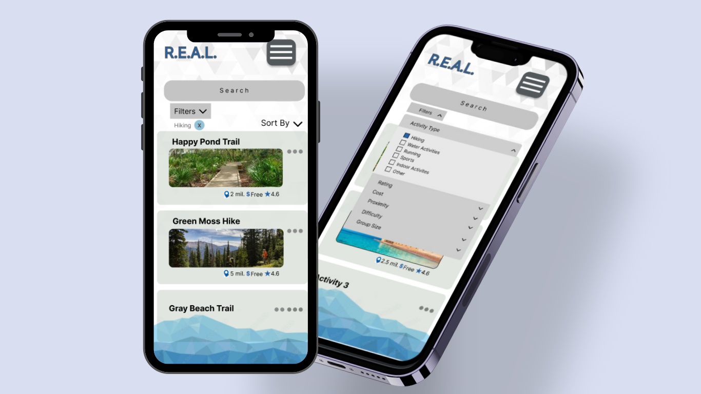
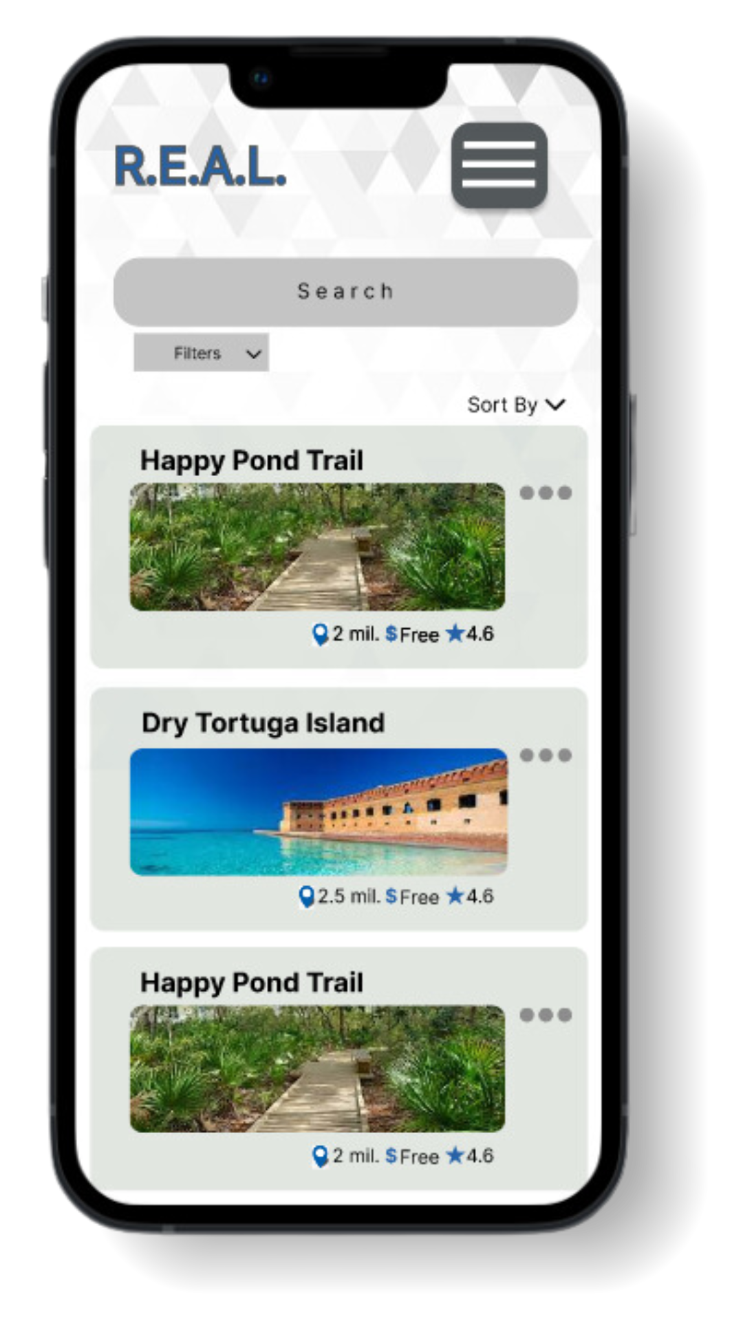
Our app empowers young adults (18-35) to easily discover and explore the outdoors by offering a curated selection of outdoor activities and events. With our user-friendly interface and powerful features, users can effortlessly browse through a variety of activities or use our targeted search to find the perfect outdoor experience.
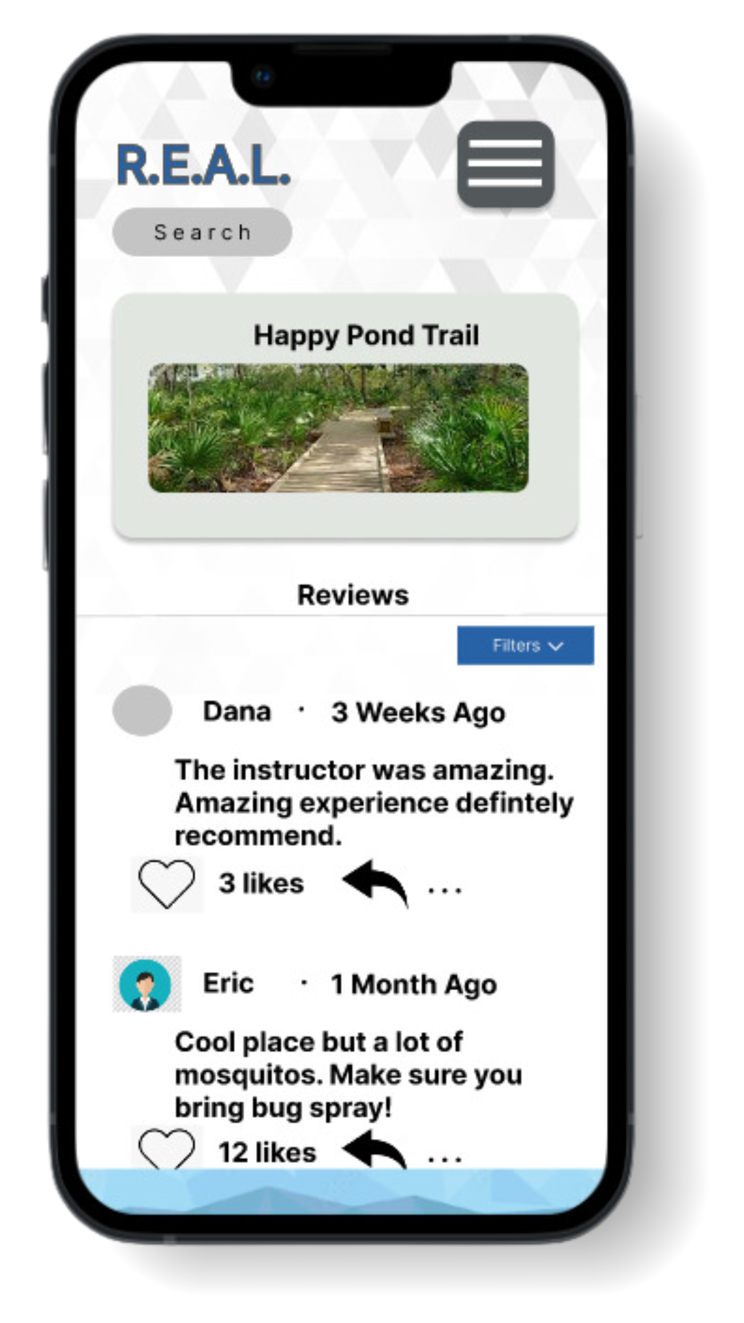
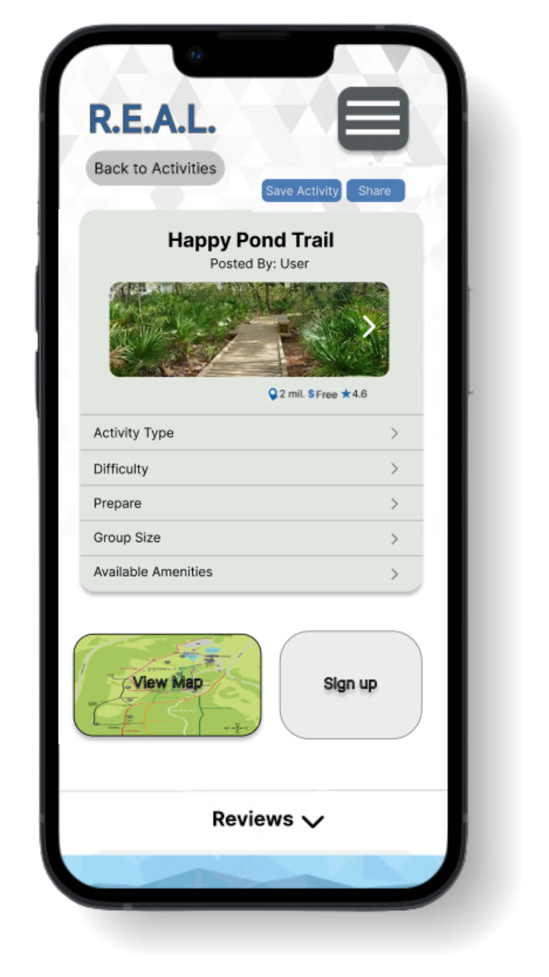


Keep scrolling to explore the design journey or
click to skip to the final prototype!
1Fitness enthusiasts are those looking for new activities that are physically challenging.
2Not all who are interested in seeking activities and experiences identify themselves as fitness enthusiasts. Instead, they range in their interests in physical fitness, with many more interested in finding outdoor activities that are unique/rare rather than physically challenging.
3Users said that sharing information and experiences with others was important.
4Information such as location and costs are important to users.
5Users are willing to travel for interesting experiences that differ from their previous experiences.
We conducted user interviews via free response survey questionnaires with our target audience to gain insights into their current activity needs, fitness goals, and frustrations with existing fitness apps. These consolidated insights from user interviews helped us pinpoint the unmet needs within the fitness app landscape, which our app would address.
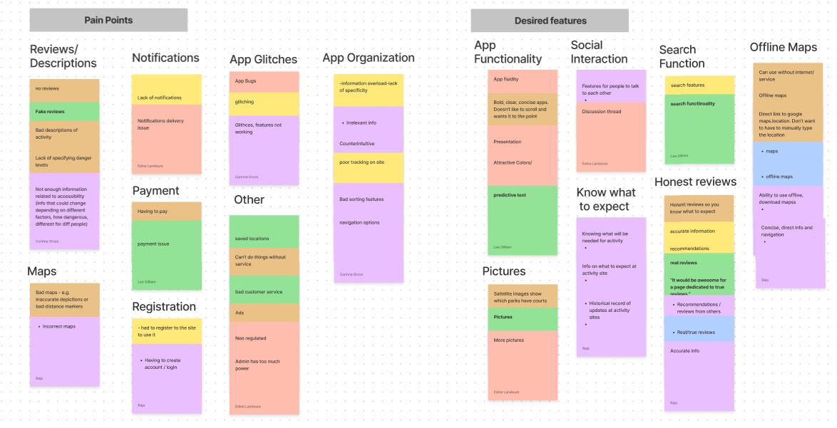
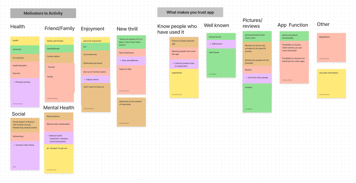
These consolidated results gave us insight into our user requirements:
As a user, I want a simple and easy app experience so that I can find relevant information as quickly as possible.
As a user, I want accurate information so that I can properly prepare for activities.
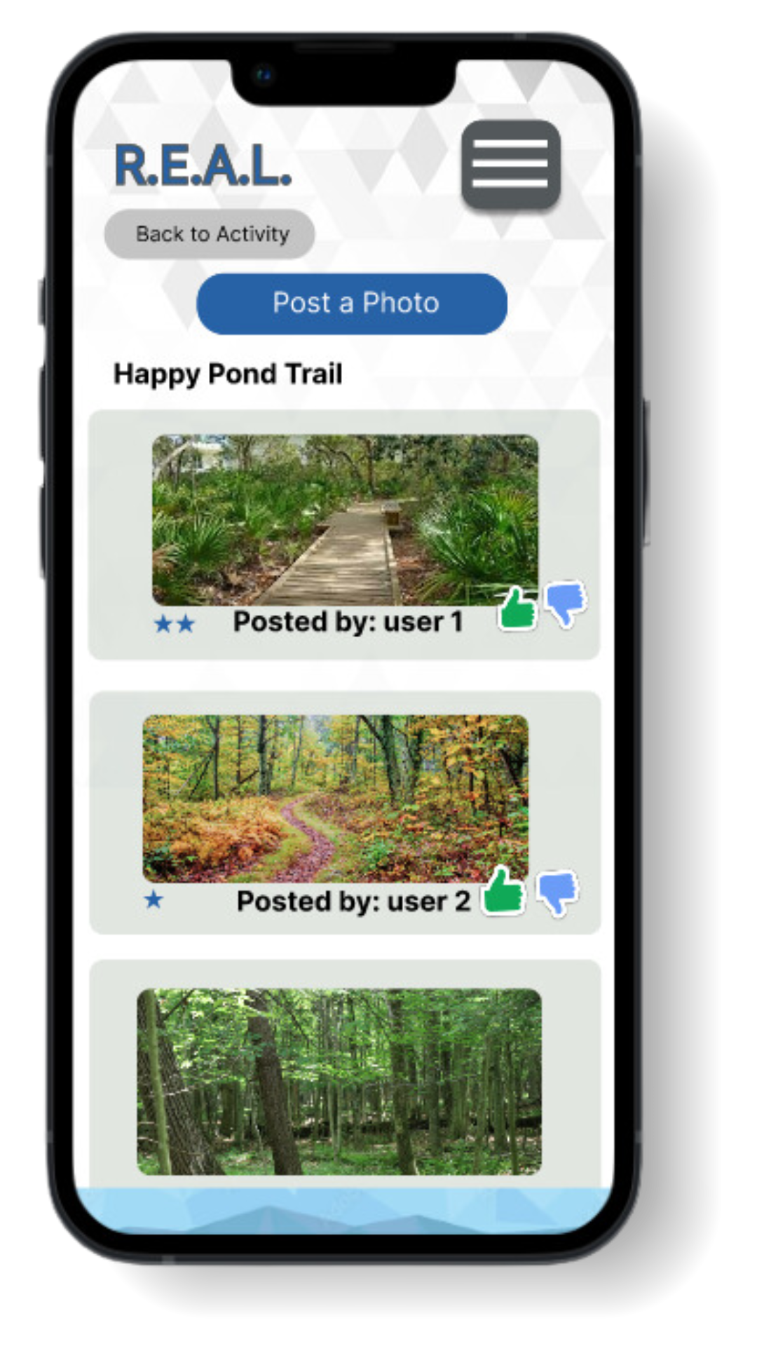
As a user, I want honest reviews from real people so I can have the most updated and trustworthy information.
As a user, I want detailed, downloadable maps so I don't get lost when I do not have a cellular or wifi signal.
1Design
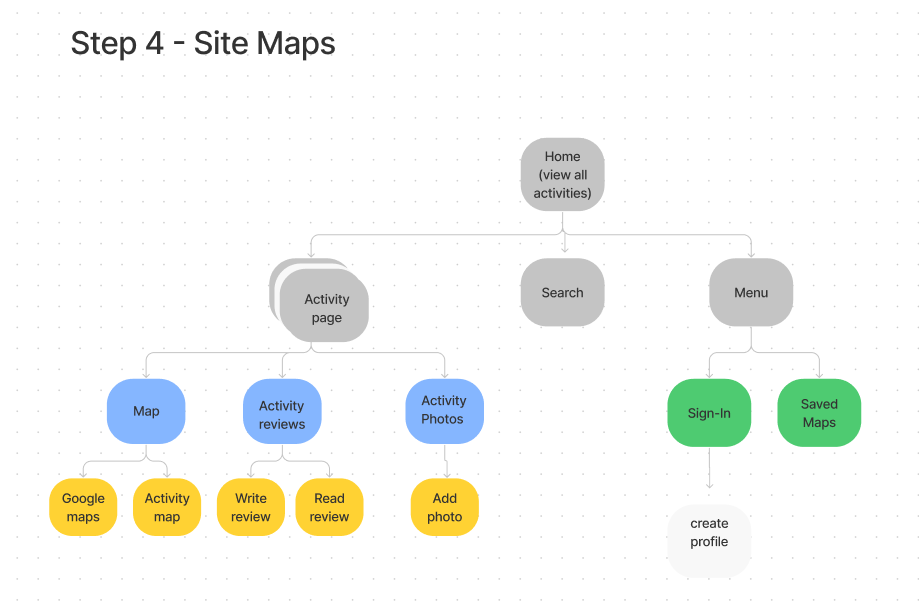
According to the insight from the users we created a site map to plan how we would organize information within the app for the smoothest navigation.
Now for the paper-based prototypes of our initial design. These low-fidelity prototypes allowed us to test our design and easily make changes according to user feedback.
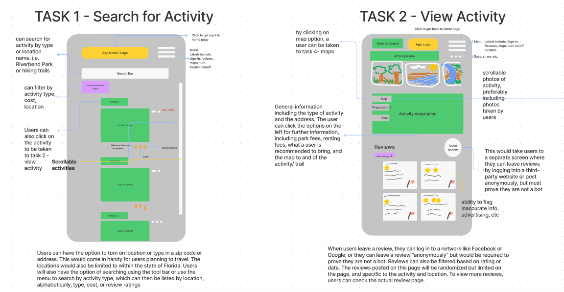
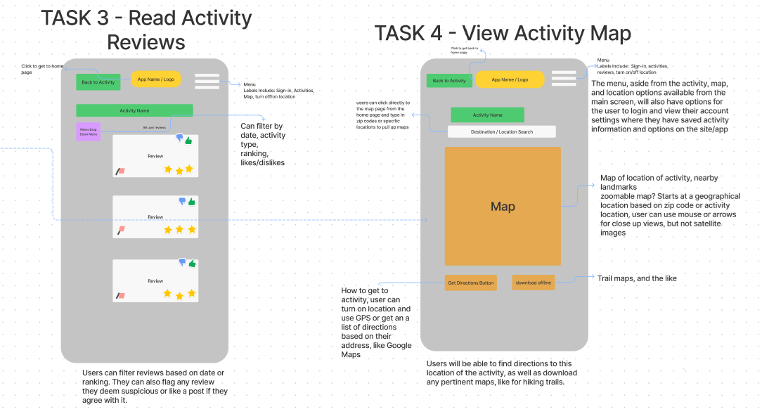
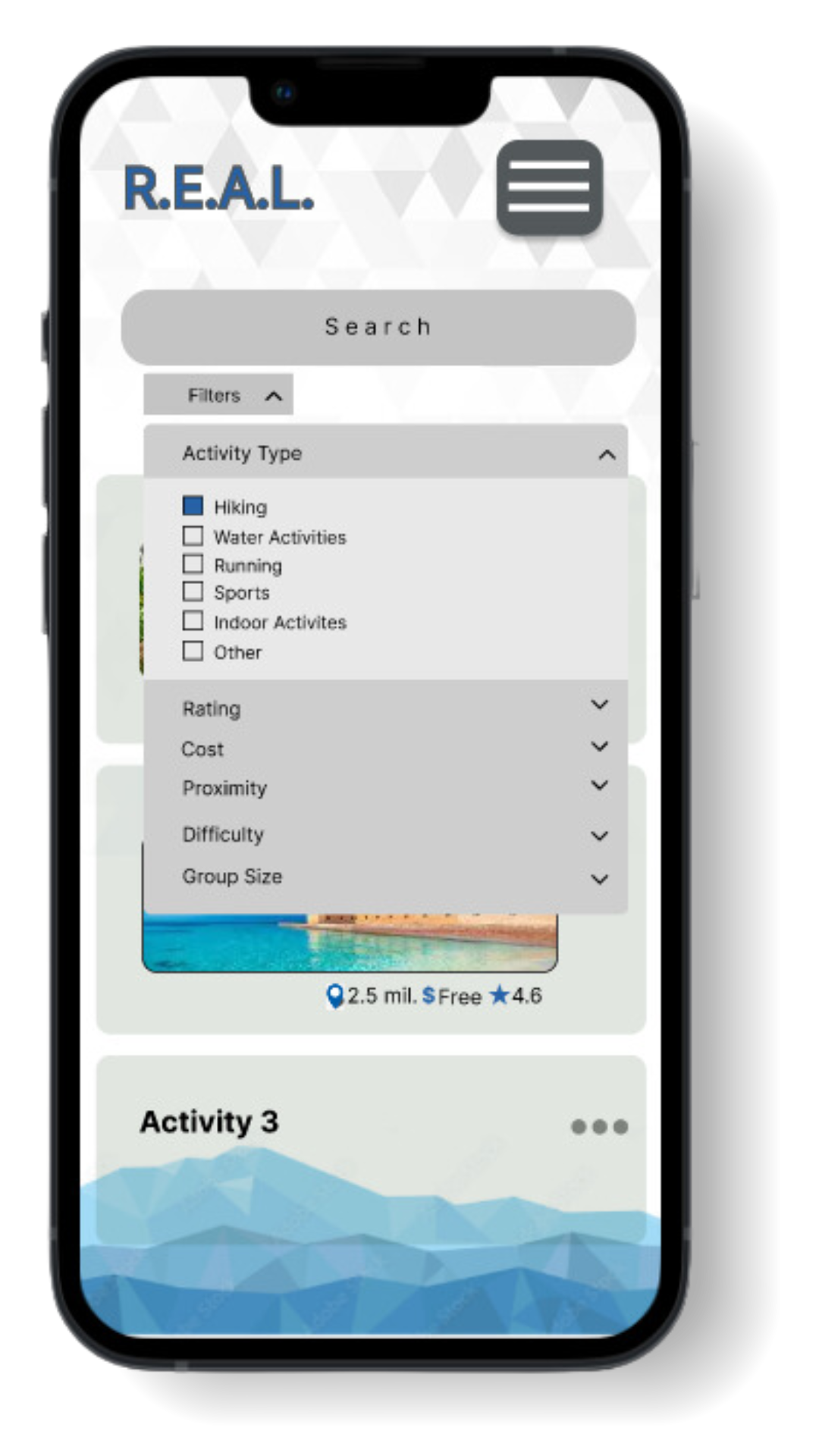
The information structure was organized for ease and understanding through the use of a hybrid information scheme. For customizability, topical, geographical, and chronological schemes were used within the activity search filters. A chronological scheme was used for activity reviews, organized by date, while keeping much of the information organized similarly to comparable apps for recognizability and consistency.
2Test
Interviews | Think-Aloud | Retrospective Questions
The Interview Process:
Establish desired user tasks

Ask interviewees to use our interactive prototypes to try to accomplish those tasks without instruction.

Interviewee was asked to verbalize what they were doing throughout the process.

Interviewer observed and took notes.

Once finished, the interviewer followed up with questions to further understand their experience.

The interviewees' challenges and successes were recorded.
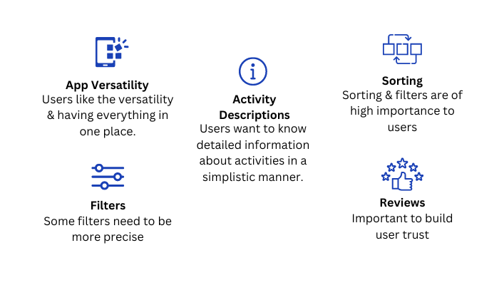
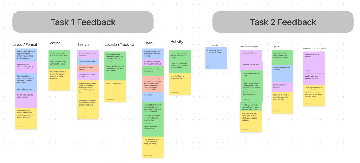
These tests were helpful to learn the successes and challenges of our initial app design while ensuring it was intuitive for users to accomplish their goals. I was then responsible for clustering that information into common themes to gain insight about the users' needs to guide that would guide our next steps.
Insights:
3Repeat
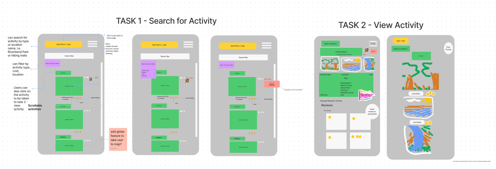
Through an iterative process, we continuously refined our understanding of user needs. Based on data from each iteration, we addressed those needs directly. We then refined our testing script to gather even more specific insights from our interviews. These insights fueled improvements in each new redesign (mid-fidely & high-fidelity), ultimately leading us to create a final app that users would love.
In future iterations, we focused on user navigation, information clarity, mobile optimization, designing for user acquisition, and app personalization.
Mid-fidelity prototype


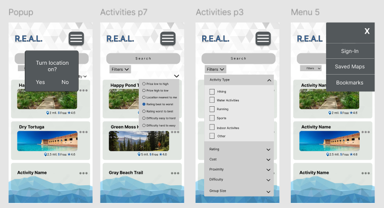
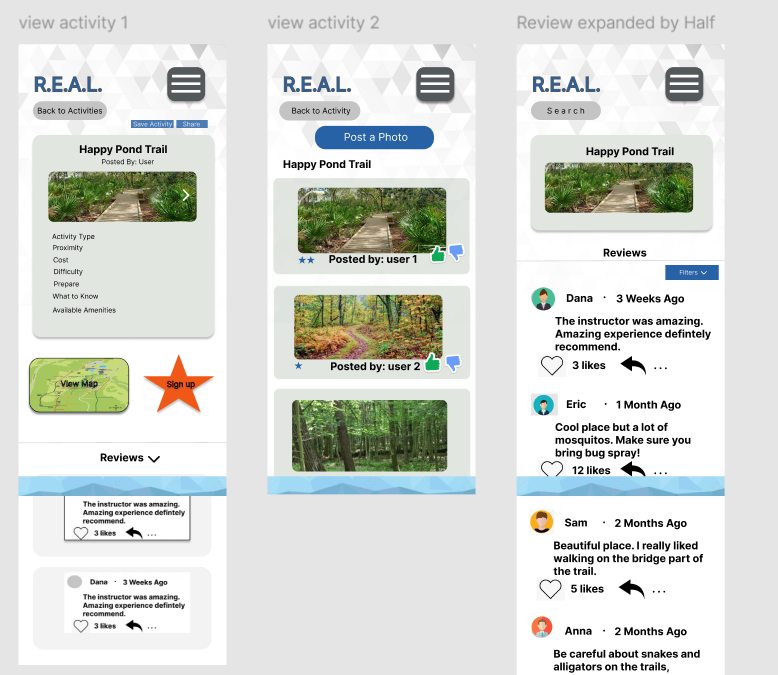
High-fidelity prototype
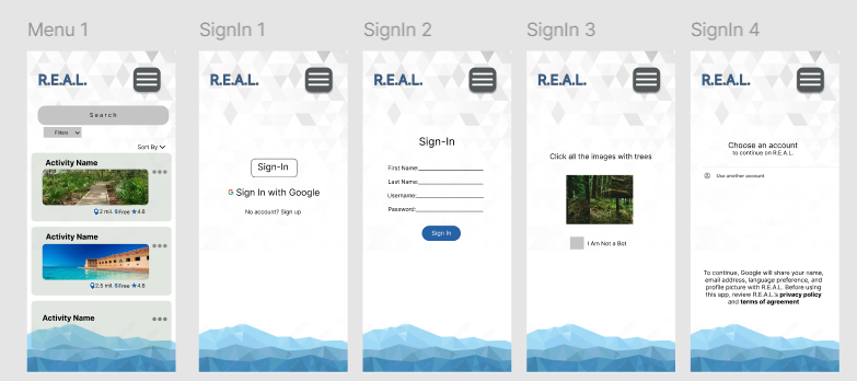
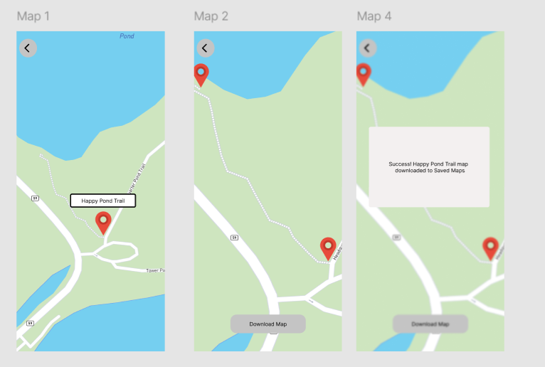
Watch the video to view the final result!

Using Figma, we crafted a high-fidelity, interactive wireframes, marking the project's official "done" stage (for now!).
Project Scope: Due to the constraints of a class project, the development of this app was limited in scope. Further resources and extended development time would be required to create a fully functional product.
User Testing: Testing was primarily conducted with Florida State University students and personal connections, limiting the demographic range of user feedback.
Location Bias: The majority of testers were located in Florida, potentially influencing the suggested activities towards a Florida-centric focus.
Though complete for now, the beauty of UX lies in its iterative nature. So given more time and resources this would be just the beginning of further refinement, testing, and enhancement.